7 Color Schemes for the Home to Transform Your Living Space
Choosing the right color scheme for a home can shape the entire atmosphere and reflect the personality of those living there. It influences moods, highlights architectural features, and creates harmony between different spaces.
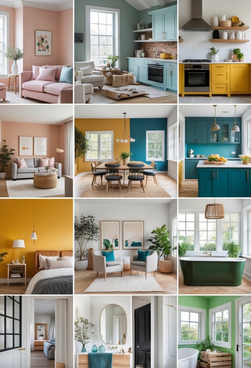
Understanding which color combinations work well together helps make decorating easier and more effective. This article will explore seven different color schemes that suit various styles and preferences, offering practical ideas for updating any home.
1: Monochromatic Blue for Calm Bedrooms
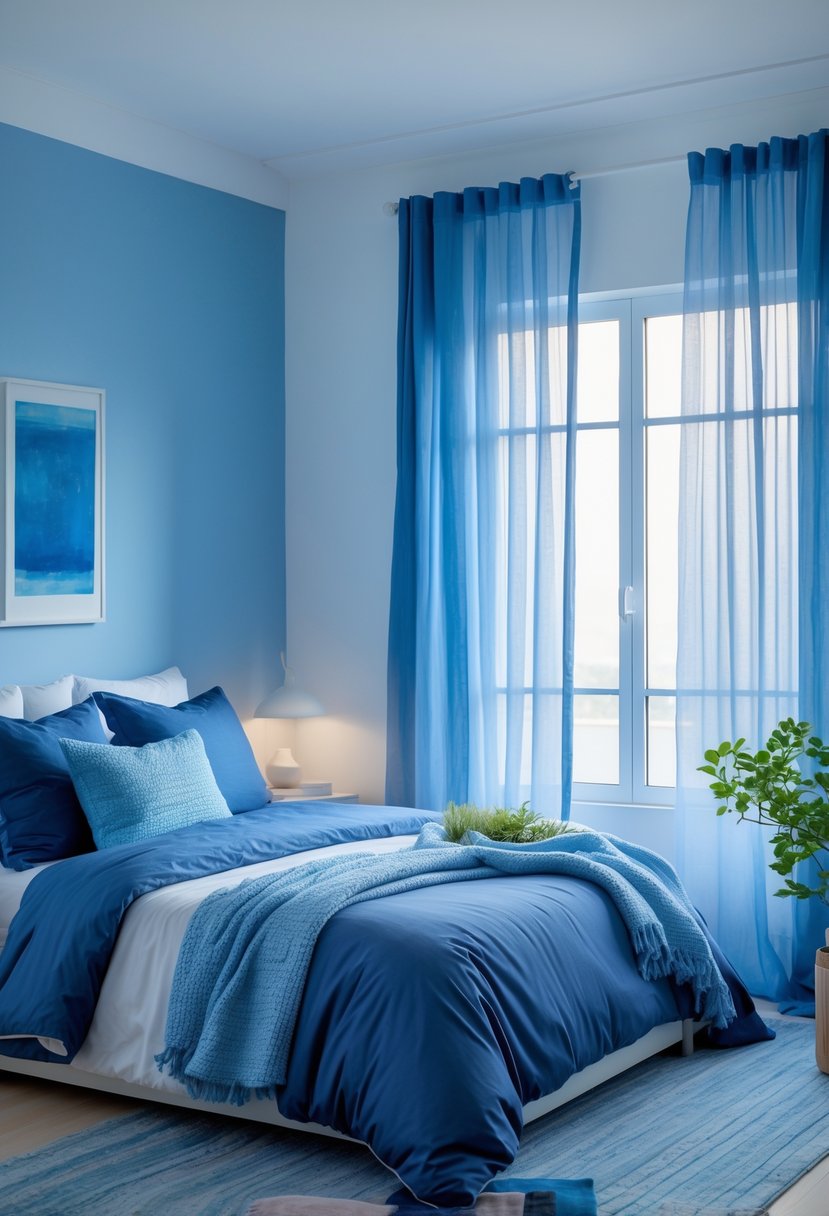
A monochromatic blue scheme uses different shades of blue to create a peaceful atmosphere. Combining light blue, navy, and teal adds depth while keeping the room unified.
This palette is ideal for bedrooms because it promotes relaxation and reduces visual clutter. Textures like soft linens or velvet can enhance the look without breaking the calm feel.
The consistent use of blue tones helps focus the mind and supports restful sleep. It works well in small or large spaces, making it a versatile choice.
2: Earth Tones in Living Rooms
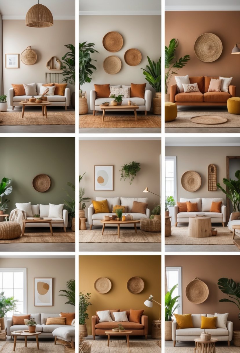
Earth tones create a calm and natural feel in living rooms. Colors like sage green, clay, and terracotta bring a sense of warmth and comfort. These shades work well together and with wood or stone elements.
Mixing soft beige with rust or dusty blue can add subtle contrast without losing the grounded look. Earth tones also pair easily with many accent colors, making them versatile for different styles.
3: Bold Red Accent Walls
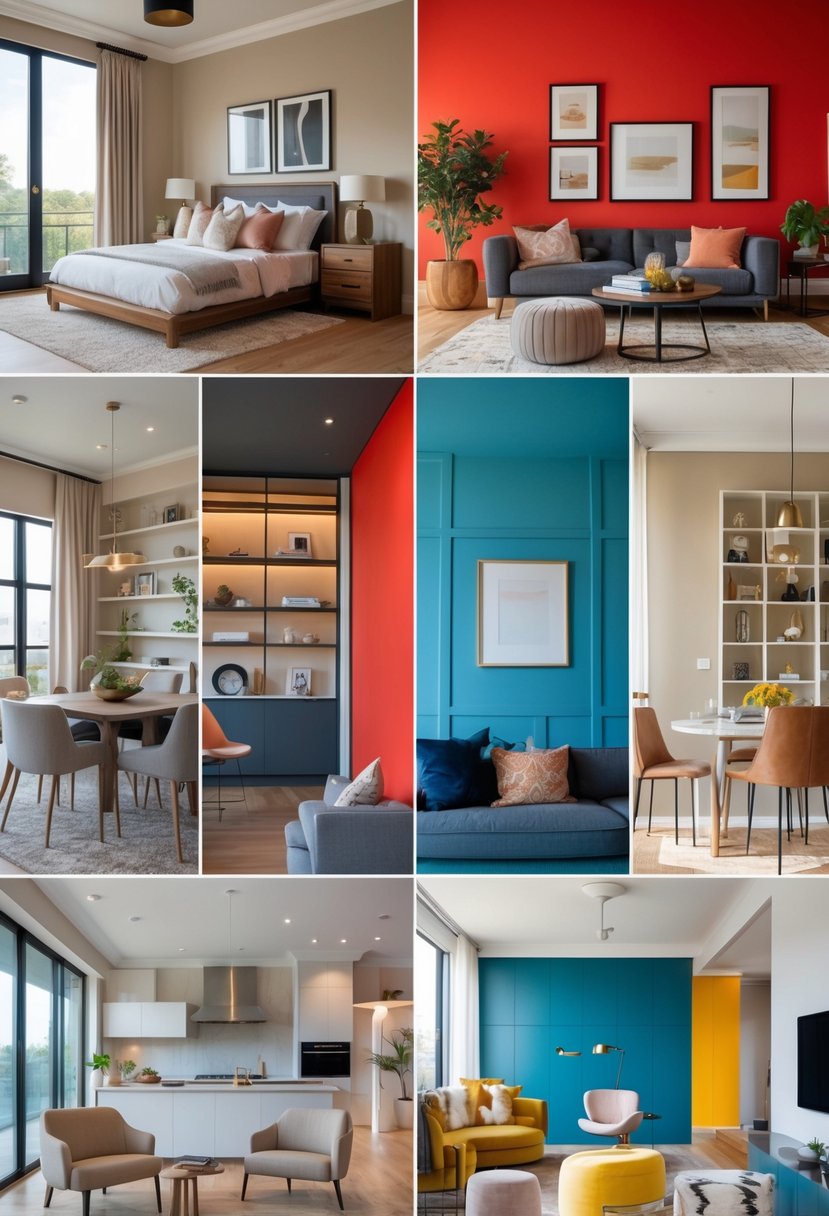
Bold red accent walls add a strong and warm feeling to a room. Red is linked to energy and passion, making it good for social spaces like living rooms.
It works best in rooms with natural light. If light is limited, painting just one wall red and balancing it with neutral tones helps keep the room from feeling too dark.
Red pairs well with colors like white, gray, and black to create contrast and balance. It can bring style and energy without overwhelming the space.
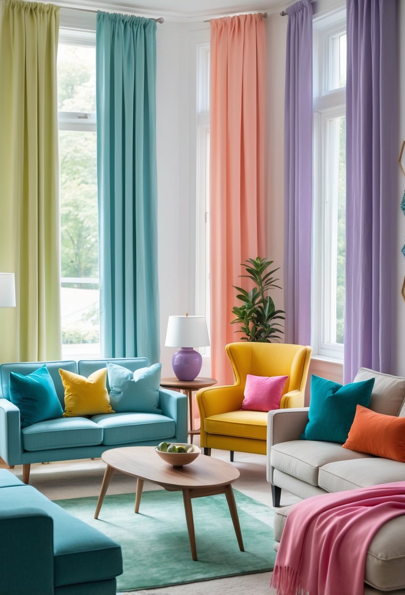
4: Soft Pastels in Nurseries
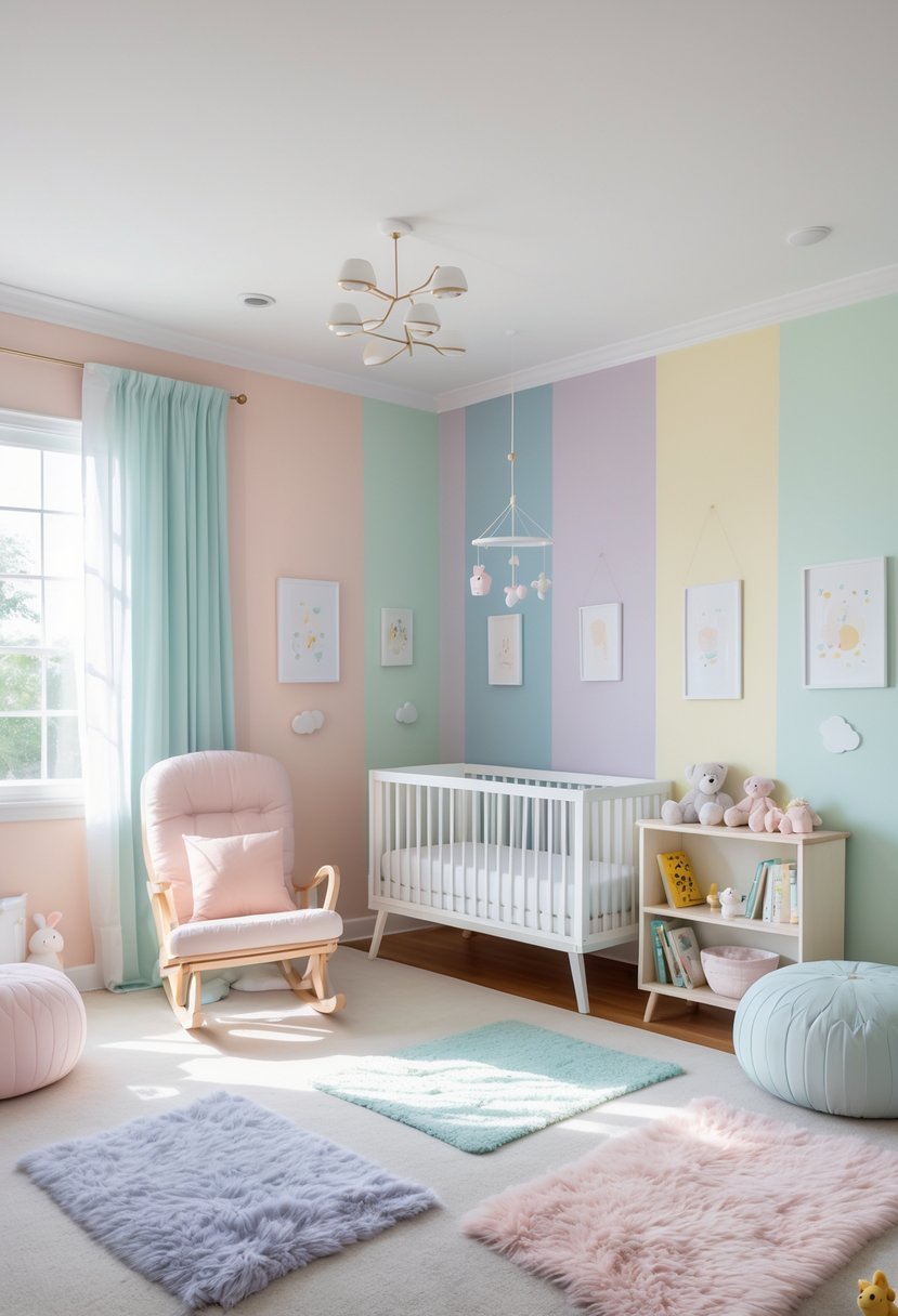
Soft pastels create a calm and peaceful space for babies. Colors like light pink, mint green, and lavender help make the room feel gentle and soothing.
These hues are often chosen because they promote relaxation. They also create a welcoming environment for both babies and parents.
Using pastels can make small nursery rooms feel brighter and more open. They work well with white or neutral furniture to keep the space simple and cozy.
5: Black and White for Modern Kitchens
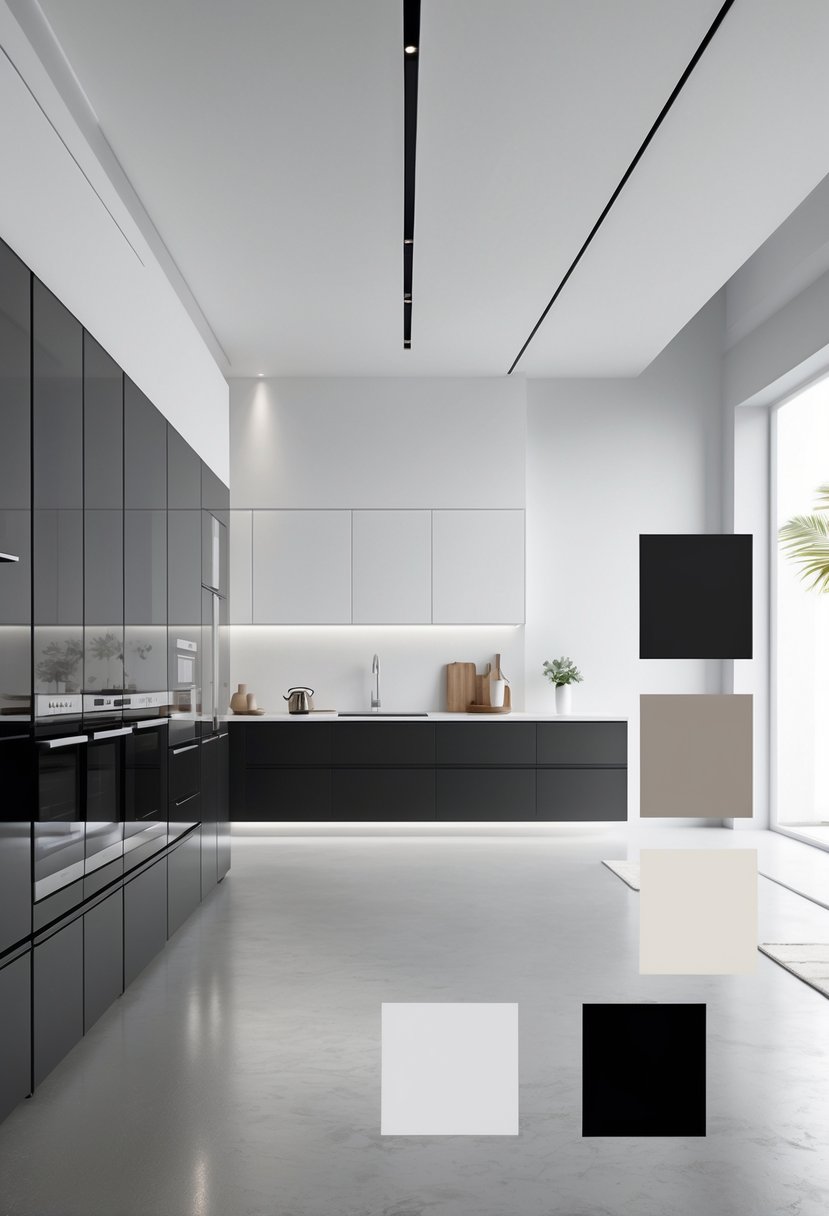
Black and white kitchens offer a clean, timeless look. This color scheme suits many styles, from minimalist to contemporary. It creates a balanced, elegant space with strong contrast.
Designers often pair black and white with chrome accents and sleek lighting. Adding wall colors like gray or teal can bring depth without overwhelming the room.
Using black backsplashes or white cabinetry helps create a striking focal point. This combination keeps the kitchen modern and visually appealing.
6: Warm Neutrals in Dining Areas
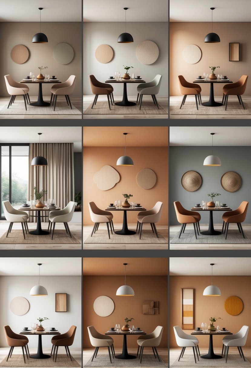
Warm neutrals create a cozy and inviting atmosphere in dining spaces. Colors like beige, soft gray, and greige work well as a calm background.
They pair nicely with wood tones and natural textures, giving the room a balanced look.
Adding deeper shades like terracotta or sage green can bring subtle contrast without overwhelming the space. This scheme supports comfort and warmth while staying stylish.
7: Jewel Tones for Home Offices
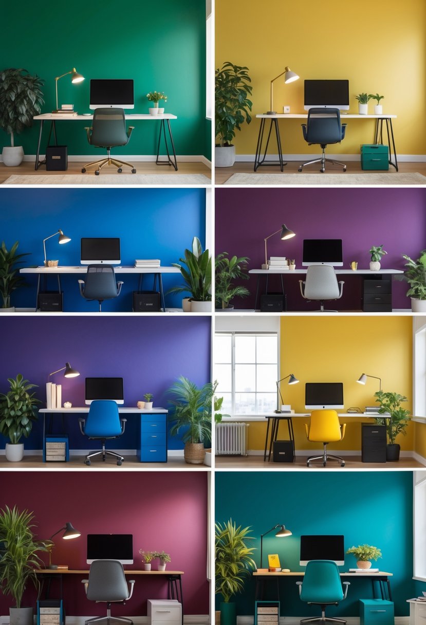
Jewel tones like emerald green, sapphire blue, and ruby red add depth and elegance to a home office. These colors create a rich, focused atmosphere without being too bright or distracting.
Pairing jewel tones with neutral colors like warm white or soft grays helps balance the room. Adding plants or artwork with jewel-toned accents can enhance the space and inspire creativity.
Understanding Color Psychology
Colors have distinct effects on how people feel and behave in their living spaces. The choice of colors can make a room feel calm, energizing, or welcoming. It’s important to know how different shades work to create the right atmosphere.
How Colors Influence Mood
Colors impact mood by triggering emotional and physical responses. For example, blue often creates a sense of calm and relaxation. It can lower heart rates and reduce stress. Red, by contrast, can increase energy and excitement but may also cause feelings of tension if overused.
Green is associated with balance and renewal, making it a good choice for areas meant for rest or focus. Yellow often brings warmth and cheerfulness but can be overwhelming in large doses. Neutral colors like beige or gray offer a quiet, grounding effect that suits many tastes.
The intensity and tone of a color also matter. Soft pastels tend to soothe, while bright or dark shades deliver stronger emotional reactions.
Choosing Colors for Different Rooms
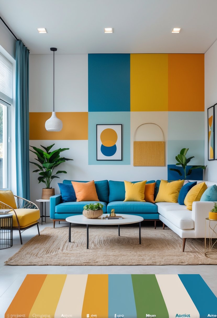
Selecting colors depends on the room’s purpose. Bedrooms benefit from cooler tones like blue or green to support relaxation and sleep. Living rooms can use warmer colors such as orange or yellow to encourage conversation and activity.
Kitchens often work well with bright colors that stimulate appetite, like red or yellow. Home offices need colors that boost focus, such as soft blues or greens. Avoid loud colors in workspaces to prevent distraction.
A well-planned color palette mixes a main color with accents to add depth. It’s useful to balance colors by considering light exposure and room size to achieve harmony.
Tips for Implementing Color Schemes
Successful color schemes require careful balance and thoughtful placement. Managing bold and neutral tones alongside highlighting key architectural elements can greatly enhance a space’s appeal and harmony.
Balancing Bold and Neutral Tones
To prevent a room from feeling overwhelming, bold colors should be offset with neutral tones. For example, if a wall is painted a bright color like deep blue or rich red, using whites, grays, or beiges on trim, furniture, or flooring can create visual ease.
A good rule is the 60-30-10 formula:
- 60% dominant neutral color
- 30% secondary color (usually a muted or softer tone)
- 10% bold accent
This method helps maintain balance while allowing bold shades to stand out without dominating the space. Textiles and accessories, like pillows or rugs, are easy ways to add small pops of bold colors without overwhelming the eyes.
Accentuating Architectural Features
Color can highlight unique parts of a home, such as molding, built-in shelves, or fireplaces. Painting these areas in a contrasting but harmonious color draws attention and creates focal points.
For example, using a darker shade on trim around windows or doors can add depth. Neutral walls with bold accents on architectural details help keep the room cohesive while emphasizing features.
Consider texture and finish as well. Matte paint can soften a feature, while glossy finishes can make it stand out more. This approach enhances the room’s style subtly without clashing with the overall scheme.