Why Your Gallery Wall Isn’t Working (And How to Fix It): Expert Tips for Perfect Arrangement
Many gallery walls miss the mark because they lack balance and thoughtful arrangement. The key to a successful gallery wall is careful curation and proper spacing to create a visually pleasing and cohesive display. Without these, even the most beautiful pieces can look chaotic or out of place.
Another common problem is ignoring the layout before hanging. Jumping straight to hanging artwork without planning can lead to uneven spacing and awkward placements. Taking time to plan the design on the floor or with templates helps ensure everything fits well together.
Finally, the wrong choice of frames or art styles can disrupt the flow. Using mismatched frames or not considering how the pieces relate can break the visual harmony. Paying attention to frame style, size, and theme ties the gallery wall into the room’s overall look.
Key Takeways
- Balanced spacing and thoughtful curation are crucial for gallery wall success.
- Planning the layout before hanging prevents uneven and awkward placements.
- Consistent frame styles and art themes improve visual harmony.
Common Reasons Gallery Walls Fall Short
Many gallery walls fail because of simple mistakes in how the art is arranged and chosen. Problems with spacing, variety, and personalization often make wall art look cluttered or unbalanced.
Improper Artwork Placement and Spacing
Incorrect placement and spacing can make a gallery wall feel messy or awkward. If the pieces are too close together, the wall looks cramped and loses impact. Too much space between items breaks the flow and makes the display feel disconnected.
A good rule is to keep spacing consistent, usually 2 to 4 inches apart depending on the wall size. Centering the whole gallery at eye level helps it feel balanced and inviting. Avoid hanging art unevenly or too high, which causes discomfort when viewing.
Using paper templates or laying pieces on the floor first can prevent these spacing errors. Proper alignment and evenly spaced artwork create a clear, professional look that draws the eye naturally.
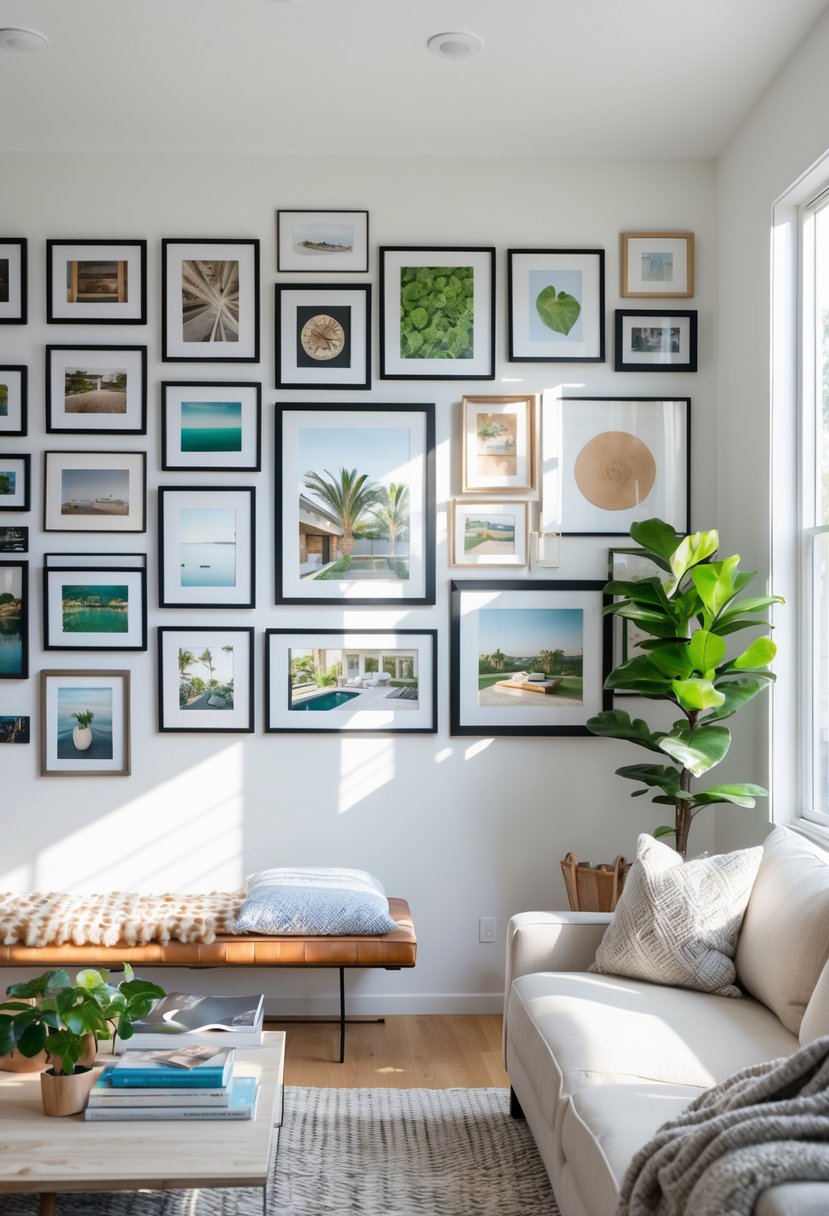
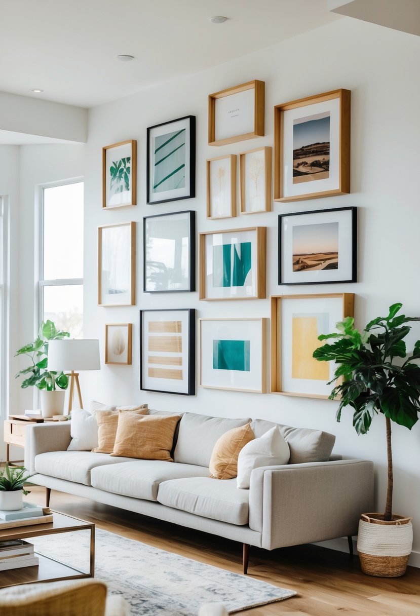
Lack of Size and Shape Variety
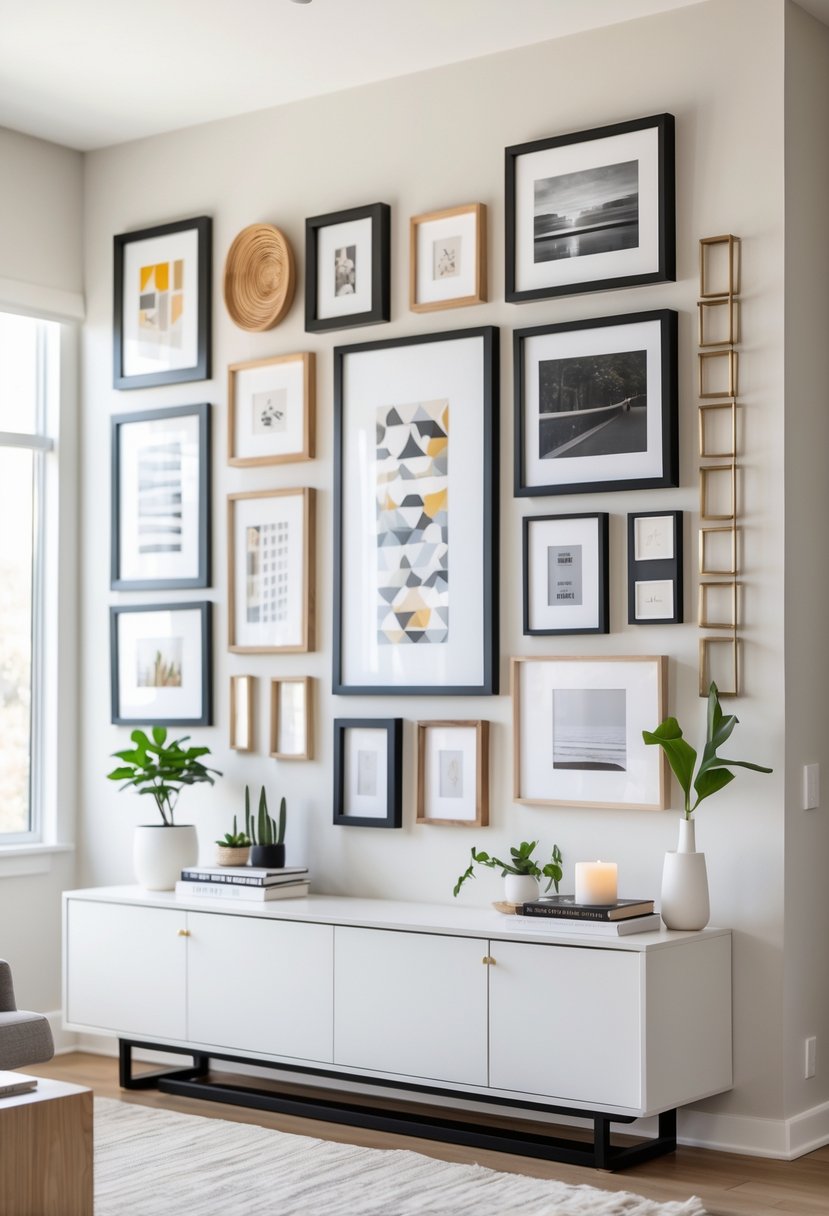
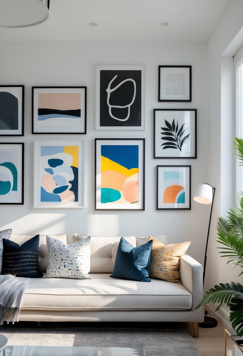
Gallery walls that use similar sized frames or lack different shapes often appear boring or flat. Without variety, the display misses visual interest and depth. Mixing small, medium, and large pieces creates a dynamic composition.
Incorporating a mix of portrait and landscape orientations also breaks monotony. Different frame styles or colors can work but should stay within a cohesive theme to avoid chaos.
Using multiple shapes and sizes helps the eye move around the gallery wall, keeping the focus on each piece. This balance between uniformity and variety is critical for a well-curated wall art display.
Missing Personal Touches
Gallery walls without personal elements can feel generic and uninspired. Including photographs, mementos, or artwork that reflect the owner’s style adds meaning and character.
Personal touches connect the gallery to the space and create emotional value. A collection of artwork that tells a story or highlights interests invites engagement and makes the wall more memorable.
Without these touches, a gallery wall may come off like a random collection rather than a thoughtful design. Integrating personal items ensures the display feels unique and authentic.
Essential Gallery Wall Design Elements
A successful gallery wall depends on several key design choices. These include picking the right colors and using texture and pattern thoughtfully. Both help create a balanced and appealing display that fits the space.
Creating a Cohesive Color Scheme
Choosing a color scheme is crucial for tying the gallery wall together. Sticking to two or three main colors keeps the look unified without feeling boring. Neutral tones like black, white, or gray work well as a base. Then, adding one or two accent colors brings life and personality to the display.
It’s important to consider the room’s existing colors. The gallery wall should complement rather than clash with furniture, paint, or flooring. Using frames or mats in matching or coordinating colors also helps maintain consistency. This approach creates a polished, intentional look that draws the eye without overwhelming the space.
Incorporating Texture and Pattern
Texture and pattern add depth and interest to a gallery wall. Mixing smooth surfaces like glass frames with rougher materials such as wood or woven fabrics keeps the wall visually dynamic. Patterns in artwork or frames can create rhythm, but should be balanced carefully with solid areas to avoid clutter.
Using different textures can highlight individual pieces while contributing to a unified whole. For example, pairing a textured canvas print with a sleek metal frame offers contrast. Patterns like stripes, dots, or geometric shapes work best when repeated subtly through multiple items, creating a flow across the wall without distraction.
Choosing and Hanging Wall Art Effectively
Selecting the right pieces and hanging them properly are key to a successful gallery wall. It’s important to balance styles and sizes, use appropriate hardware for each piece, and frame art in a way that enhances the space.
Mixing Different Types of Wall Art
Using a variety of art types creates visual interest. Combining prints, photos, paintings, and even objects like mirrors or shelves can make the gallery dynamic.
Balance is crucial. Place larger or heavier pieces on the bottom or center to anchor the display. Smaller pieces work well around these anchors. Stick to a consistent color palette or theme to keep the arrangement cohesive.
Spacing matters. Keep about 2-3 inches between items for a clean look. Avoid crowding or very uneven gaps, which can make the wall appear cluttered or unfinished.
Best Practices for Hanging with Command Strips
Command strips work well for lightweight wall art and avoid damage to the walls. They are easy to use and remove, making them ideal for renters.
Before applying, clean the wall with rubbing alcohol, not water, to ensure the strips stick properly. Follow weight limits carefully; typically, strips hold up to 16 pounds, but check the package.
Use multiple strips on heavier pieces to spread the weight. Press firmly for 30 seconds when applying and wait an hour before hanging the art. Avoid hanging strips in humid areas, as moisture can weaken the adhesive.
Framing and Sizing Strategies
Frames should complement the art and room style without overpowering the image. Simple frames often work better for galleries, as ornate frames can look busy.
Size impacts balance. Use larger pieces to fill big wall spaces, measured so the art is about two-thirds to three-quarters the width of the furniture beneath it. Small art on very large walls can look lost.
Group artworks of similar sizes or use mats inside frames to create uniformity when mixing small pieces. This helps the gallery appear intentional rather than random.
Fine-Tuning for Visual Harmony
Creating a visually harmonious gallery wall means making sure it fits well with the room and stands out in the right way. Careful choices about balance, color, and lighting help the display feel connected and appealing rather than cluttered or lost.
Balancing Gallery Walls with Room Decor
A gallery wall should complement the room’s existing color scheme and style. If the room has bold colors or busy patterns, the gallery wall needs more neutral or simple frames to avoid overwhelming the space.
Texture plays a key role. Mixing different frame textures, like smooth metal and rough wood, can add depth. But it’s important not to mix too many patterns or styles. Keeping a consistent style or theme ties the wall to the room better.
They should also consider scale. Large prints can overpower a small room, while too many tiny pieces can look scattered. Grouping artwork by size or theme helps create a balanced and unified display.
Tips to balance gallery walls:
- Match frame colors or finishes with furniture tones
- Use similar sized frames or group by size
- Introduce subtle textures to complement fabrics or rugs
- Maintain consistent spacing between pieces
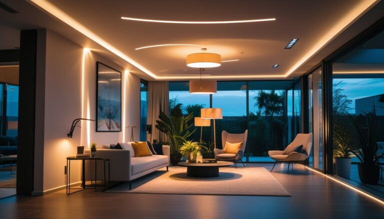
Adjusting Lighting for Impact
Lighting changes how a gallery wall is seen and felt. Proper lighting highlights the textures and colors in the artwork and frames.
Natural light is best but should be controlled. Too much direct sunlight can fade prints. Using UV-filtering window covers can protect the art without losing brightness.
Artificial lighting like adjustable track lights or picture lights can focus light on key pieces. Warm white bulbs help colors look natural and inviting.
Position lights so they don’t create harsh shadows or glare. Even lighting across the gallery wall prevents some pieces from being overlooked.
Lighting recommendations:
| Lighting Type | Best Use | Notes |
|---|---|---|
| Natural Light | Soft, indirect daytime lighting | Use UV protection to avoid fading |
| Track Lighting | Highlight groups or large pieces | Adjustable direction and angle |
| Picture Lights | Focus on single artworks | Avoid harsh glare |
| Ambient Lighting | General room brightness | Complements accent lighting |
Adjusting lighting thoughtfully enhances the gallery wall’s appeal and connects it to the room’s mood.