5 Color Schemes for Weddings That Elevate Your Big Day
Choosing the right color scheme is an important part of planning a wedding. It affects the overall look and feel of the event, from decorations to attire. Couples often look for palettes that match their style and the mood they want to create.
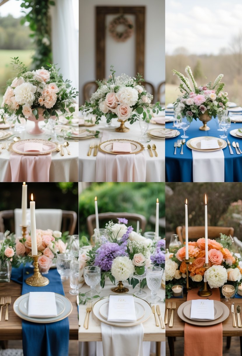
Understanding popular and timeless wedding color schemes can help couples make a confident choice that fits their vision. This article explores five color combinations that work well for many weddings. Each palette offers options for different tastes and seasons.
1: Navy and Sage Green for a timeless, elegant look
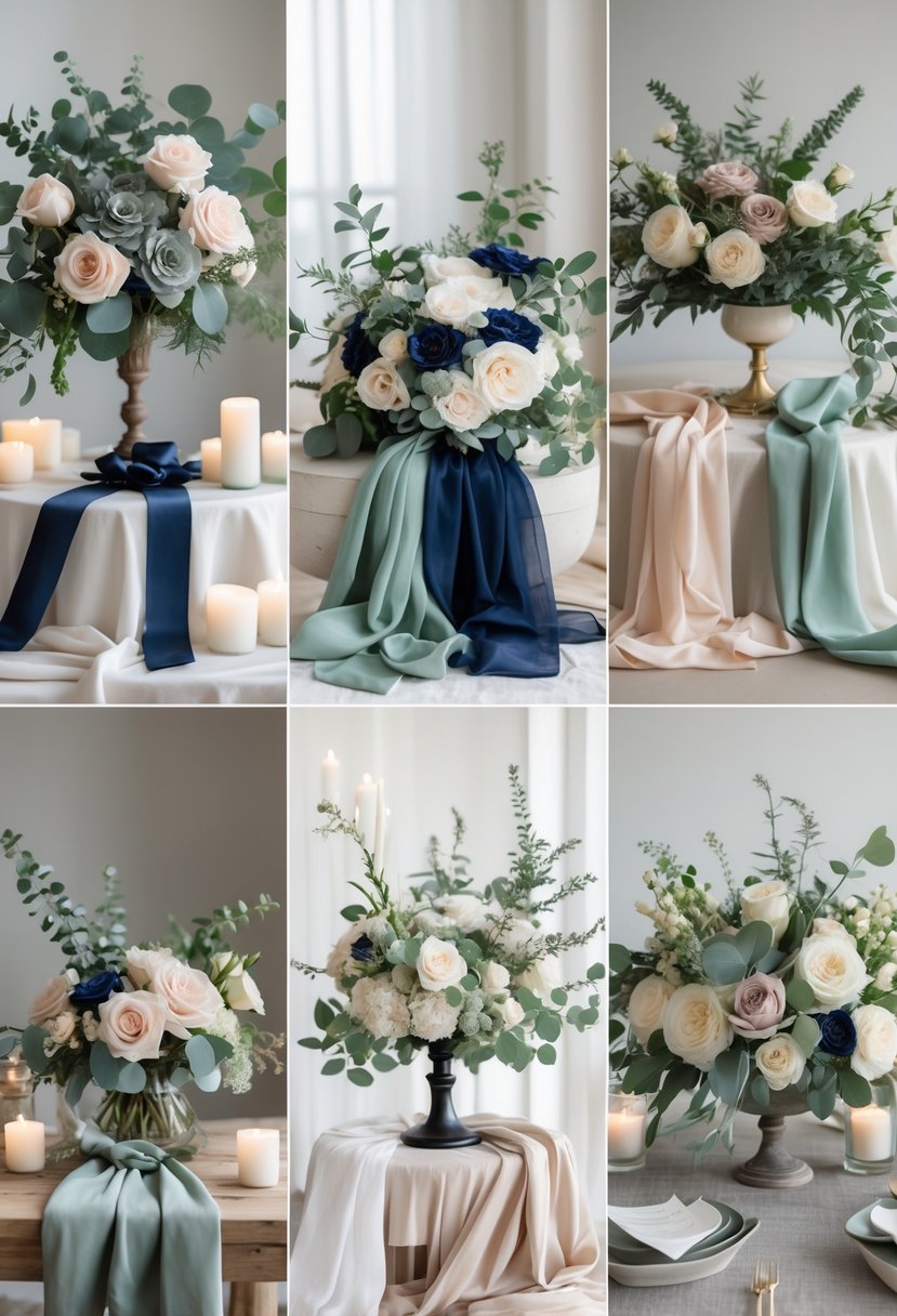
Navy and sage green create a classic and elegant color scheme for weddings. This pairing adds depth and sophistication without feeling heavy. It works well in different elements, like bridesmaids’ dresses, floral arrangements, and décor.
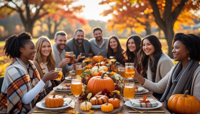
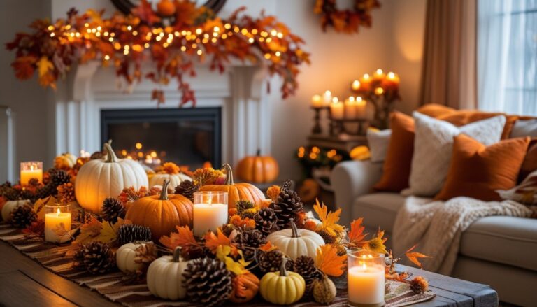
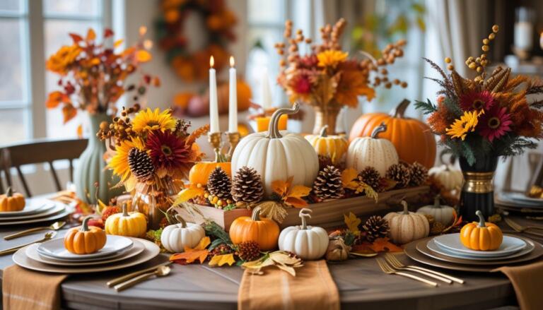
2: Burnt Orange paired with Cream for a warm autumn wedding
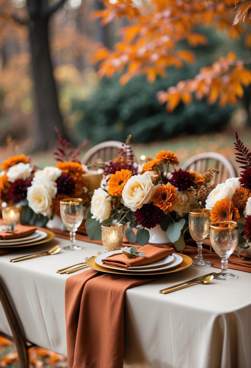
Burnt orange and cream create a soft, inviting look. This combination brings warmth without feeling too bold.
It works well for autumn weddings, matching the season’s natural colors. The cream tones balance the deep, rich burnt orange.
3: Blush Pink and Gold for a romantic, classic vibe
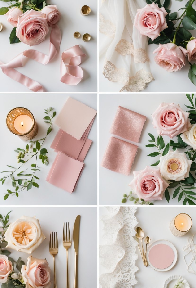
Blush pink and gold create a timeless, elegant look for weddings. The soft pink adds warmth, while gold brings a touch of luxury.
This color scheme works well in decorations, floral arrangements, and accents like tableware. It fits both classic and modern styles with ease.
4: Dusty Blue and Gray for a soft, modern atmosphere
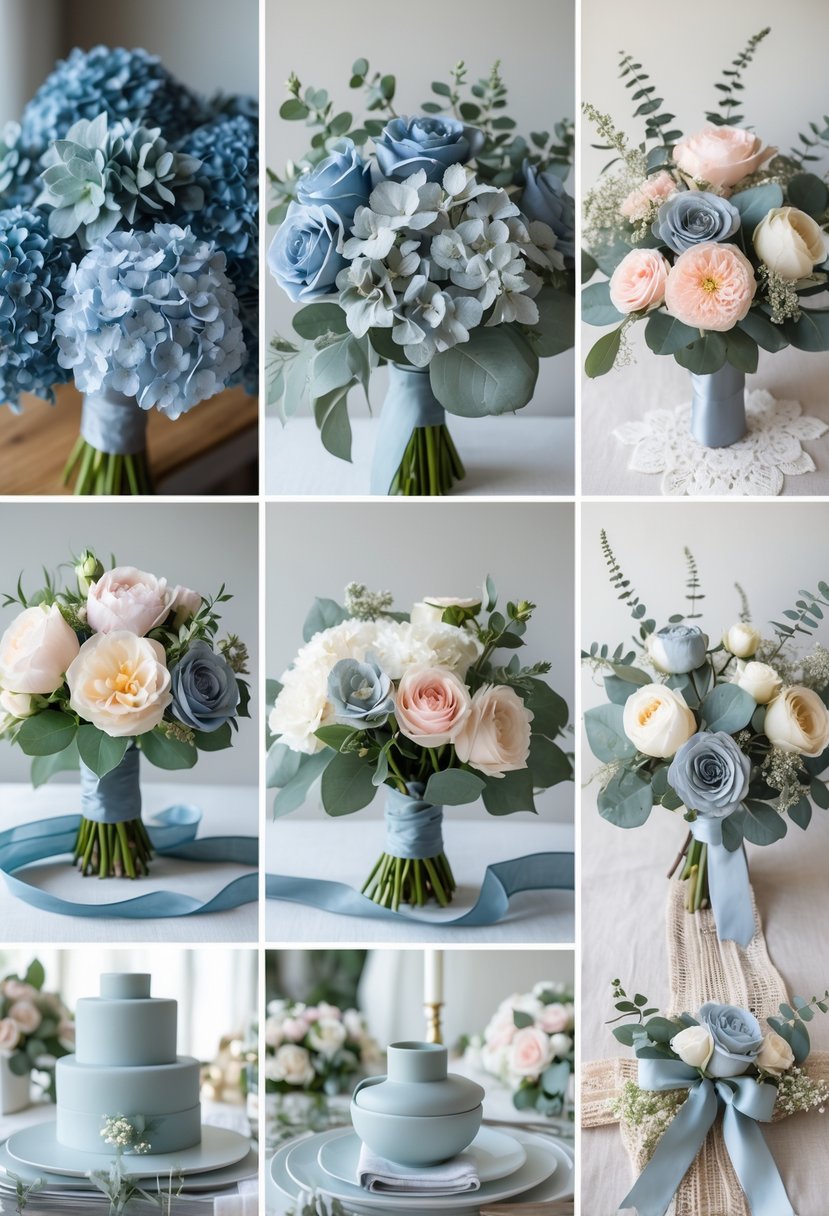
Dusty blue and gray create a calm and elegant look. The colors work well together to make a soft, modern feel.
This combination suits many wedding styles, from classic to contemporary. It adds subtle charm without being too bold.
5: Lavender and Sage for a fresh, spring-inspired palette
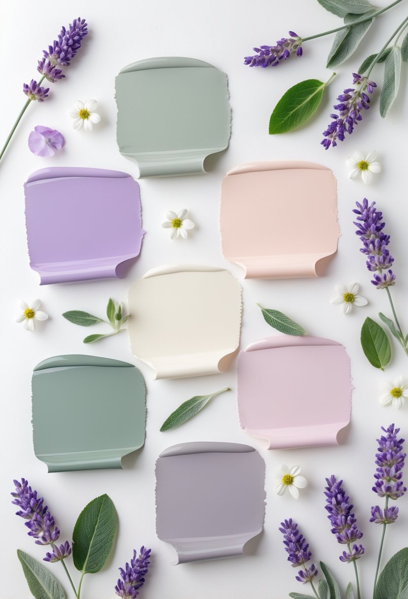
Lavender and sage create a soft, natural color scheme. This mix suits spring weddings with a calm and romantic vibe.
The combination works well in outdoor venues like gardens or woodlands. It brings a fresh and elegant feel without being too bold.
How Color Schemes Influence Wedding Atmosphere
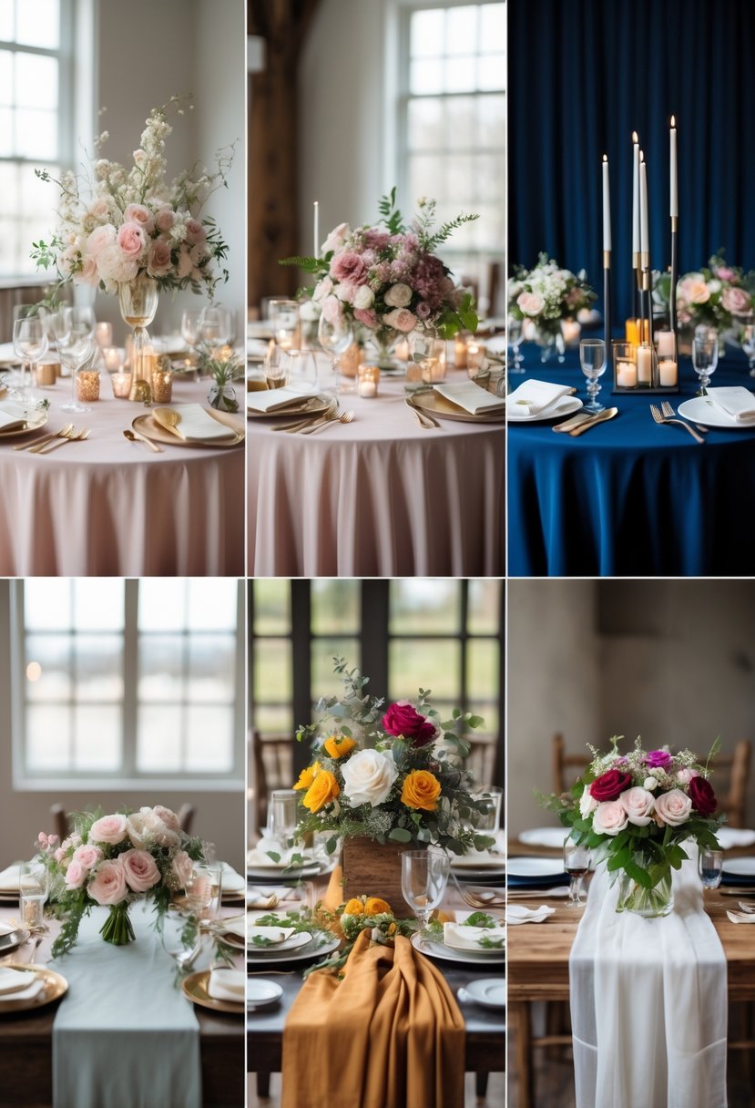
Colors shape the feeling of a wedding day through mood, season, and setting. Carefully chosen colors can create energy, calm, or elegance. The right combination works with the time of year and venue style to make the event feel unified and thoughtful.
Psychological Impact of Colors
Colors affect emotions and mindset during the wedding. For example, soft blues and greens can bring calm and relaxation, while warm reds and oranges add energy and excitement. Neutral colors like beige or gray give a grounded and timeless feel.
Bright colors such as chartreuse and lime symbolize strength and positivity. They can make the event feel fresh and lively but need balance with softer tones to avoid overwhelming guests.
Choosing colors based on their psychological effects helps the couple set the tone they want for their celebration. Colors should support the mood, whether it is romantic, joyful, or formal.
Seasonal Considerations
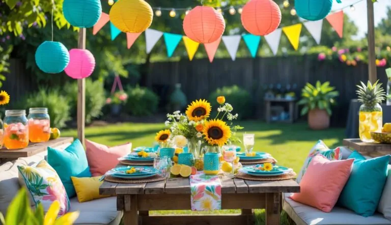
Season plays a big role in which colors feel most natural and fitting. Spring weddings often use pastels like blush, mint, or lavender. Summer favors bright and vibrant tones such as coral, turquoise, or sunflower yellow.
Fall weddings lean toward deeper, earthy colors—think burnt orange, burgundy, and olive green. Winter palettes often include rich jewel tones like emerald, navy, or plum, adding warmth to colder months.
Aligning the color scheme with the season boosts the wedding’s charm and ensures colors complement the natural surroundings. It also influences floral choices and décor styles.
Matching With Venues
The wedding venue impacts color choice by its architecture, lighting, and environment. A rustic barn looks great with warm, earthy tones and soft neutrals. Beach weddings benefit from light, airy colors like ocean blue, seafoam green, and sandy tan.
Formal ballrooms often call for classic color combinations such as black and white or gold with ivory to match the elegance of the space. Outdoor garden venues pair well with natural greens and floral-inspired pastels.
Colors should enhance the venue, not clash or fade into the background. This harmony strengthens the overall visual appeal and makes photos stand out.
Tips for Coordinating Wedding Elements With Color Palettes
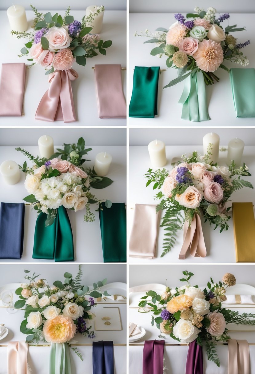
Choosing a wedding color palette involves more than just picking shades. It requires thoughtful matching across attire, decor, and paper goods to create a balanced and polished look. Attention to how colors work together in fabric, flowers, and printed materials can tie the entire event design into a cohesive experience.
Bridal Attire Coordination
The bride’s dress is primarily white or ivory, so the color scheme usually complements rather than competes with it. Bridesmaids’ dresses should reflect the chosen palette but balance between bold and muted tones to maintain harmony. For example, deep jewel tones work well for fall weddings, while soft pastels suit spring.
Accessories like ties, shoes, and jewelry are also opportunities to echo the wedding colors. Groomsmen’s ties or pocket squares often mirror bridesmaid dress colors to visually connect the wedding party. Keeping fabric textures consistent, like satin or chiffon, helps unify the look without overwhelming the colors.
Decor and Floral Selections
Flowers should either match or provide a soft contrast to the main color scheme. If the palette is vibrant, choosing whites or greens in the floral arrangements can prevent a cluttered look. For more muted palettes, adding a few bright flowers provides a focal point.
Table linens, chair covers, and other decor elements should reflect the palette in layers. Using one main color for tablecloths and another complementary shade for napkins or candles creates depth. It’s important to test these combinations in the venue lighting, as colors can look different in natural versus artificial light.
Stationery and Details
Invitations, menus, and place cards offer a small but important chance to reinforce the wedding palette. Consistency here strengthens the theme from arrival to reception. Using color accents, such as borders or fonts in the accent palette, draws subtle attention.
Paper quality and texture also influence how colors appear. Matte paper softens shades, while glossy finishes make colors pop. Coordinating envelopes and stamps with invitation colors ensures the first impression aligns with the event’s overall look.
